Every year, paint and design authorities reveal their Color of the Year — a singular hue that reflects cultural currents, design trends, and the mood of the moment. For 2026, the selections span from calming neutrals to rich, deep tones and nature-inspired greens, giving homeowners and designers alike plenty of inspiration.
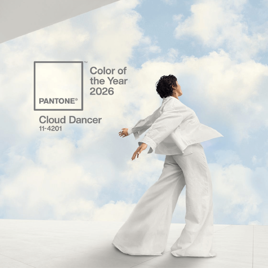
Pantone — Cloud Dancer (PANTONE 11-4201)
Pantone’s pick for 2026 is Cloud Dancer, a soft, luminous off-white that feels serene and open. This quiet neutral is all about creating space and mental clarity — ideal for minimalist interiors or as the perfect backdrop for more expressive accents. While it may seem subtle, it’s a versatile foundation that plays beautifully with everything from wood tones to bold statement pieces.
Design Tip: Use Cloud Dancer on walls throughout open-plan spaces to bounce light and make rooms feel larger and more cohesive.
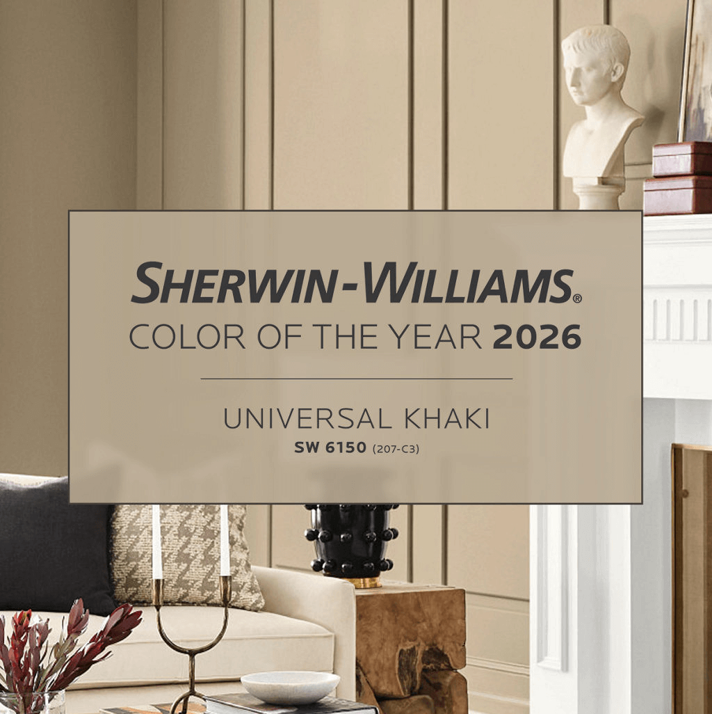
Sherwin-Williams — Universal Khaki (SW 6150)
Sherwin-Williams chose Universal Khaki — a warm, earthy neutral with subtle green and beige undertones that bring both comfort and sophistication to interiors. It’s a balanced, versatile shade that works just as well in living rooms and bedrooms as in kitchens or hallways.
Design Tip: Pair Universal Khaki with deep woods, creamy whites, or olive greens for a grounded, timeless palette.
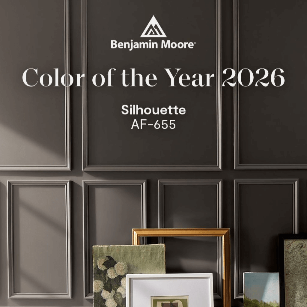
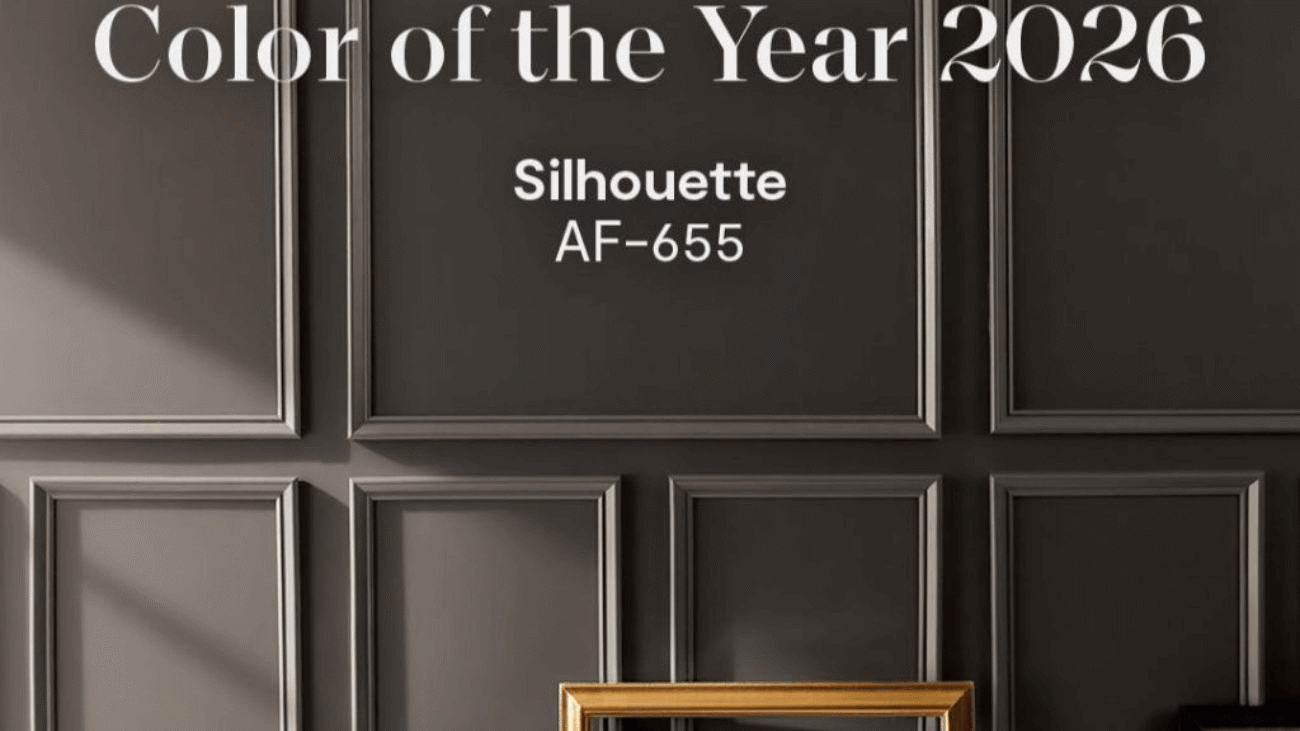
Benjamin Moore — Silhouette (AF-655)
Benjamin Moore’s 2026 Color of the Year, Silhouette, is a rich, deep burnt umber with charcoal undertones — a moody but elegant shade that gives spaces a sense of depth and warmth. This dramatic neutral bridges the gap between bold and timeless, making it suitable for accent walls, intimate rooms, or even cabinetry.
Design Tip: Complement Silhouette with metallic fixtures (bronze or brass) and lighter neutrals to avoid feeling too heavy.
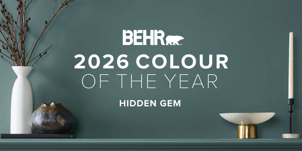
Behr — Hidden Gem (N430-6A)
Behr’s pick, Hidden Gem, is a smoky blue-green — a jewel-like hue that feels both restful and expressive. It’s equally at home in a cozy bedroom or a stylish kitchen island, and it responds beautifully to changes in light throughout the day.
Design Tip: Use Hidden Gem on an accent wall or cabinetry to elevate a space without overwhelming it. It pairs especially well with natural wood and warm metals.
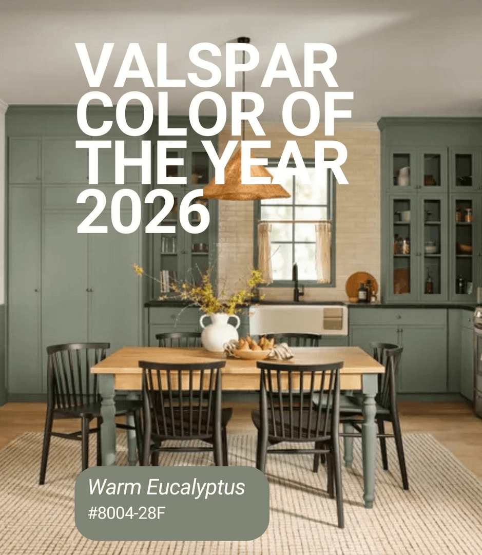
Valspar — Warm Eucalyptus (8004-28F)
Valspar’s Color of the Year, Warm Eucalyptus, draws from nature with its muted gray-green that evokes calm and balance. It brings a grounded, organic feel to interiors and complements a wide variety of design styles — from contemporary to traditional.
Design Tip: Warm Eucalyptus works beautifully in spaces meant for relaxation, like bedrooms and bathrooms, and pairs nicely with creams, soft blues, and earthy browns.
What This Year’s Picks Tell Us About Design in 2026
2026’s color selections reveal a collective move toward grounded, calming, and versatile tones. From the airy neutrality of Pantone’s Cloud Dancer to the atmospheric depth of Benjamin Moore’s Silhouette and the nature-inspired greens of Behr and Valspar, these colors reflect our desire for spaces that nourish wellbeing and personal expression.
Whether you’re refreshing a whole home or just updating a room, these Color of the Year picks offer a rich foundation from which to build a beautiful, lasting palette.
Pro Tip: Don’t be afraid to mix elements — pair a neutral like Universal Khaki with a strong accent like Silhouette or Hidden Gem for depth and personality.