If the last few years were about playing it safe—white kitchens, black fixtures, and “timeless” everything—April is pushing back in the best way.
Across lighting, plumbing, tile, and hardware, brands are reintroducing color with confidence. Not as an accent. Not as a “maybe someday.” But as a core design decision.
And honestly? It’s about time.
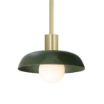
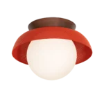
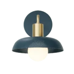
Lighting That Doesn’t Apologize
Brands like Cedar and Moss are leading the charge by proving lighting doesn’t have to fade into the background.
Their fixtures are handmade, design-driven, and increasingly available in bold finishes like persimmon, ocean blue, and deep green—bringing color directly into one of the most overlooked design layers.
Why this matters:
Lighting sits at eye level. When it carries color, it becomes architecture—not just illumination.
Takeaway for your home:
If you’re nervous about committing to colorful cabinetry or tile, start with lighting. It’s lower commitment, high impact, and instantly modernizes a space.
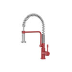
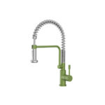
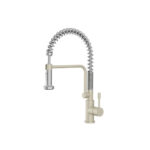
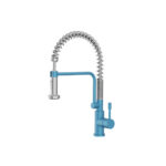

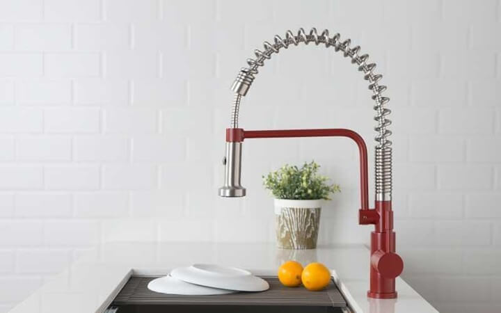
Kitchen Faucets, But Make Them Fashion
Flusso is rethinking what a faucet can be—less utility, more statement piece.
We’re seeing saturated finishes, softer silhouettes, and colors that feel pulled from fashion rather than plumbing catalogs.
Why this matters:
The faucet is one of the most used—and seen—elements in your kitchen. Making it intentional elevates the entire room.
Takeaway for your home:
Pair a colored faucet with a neutral countertop and backsplash for balance. Or go bold-on-bold if you’re ready to commit.
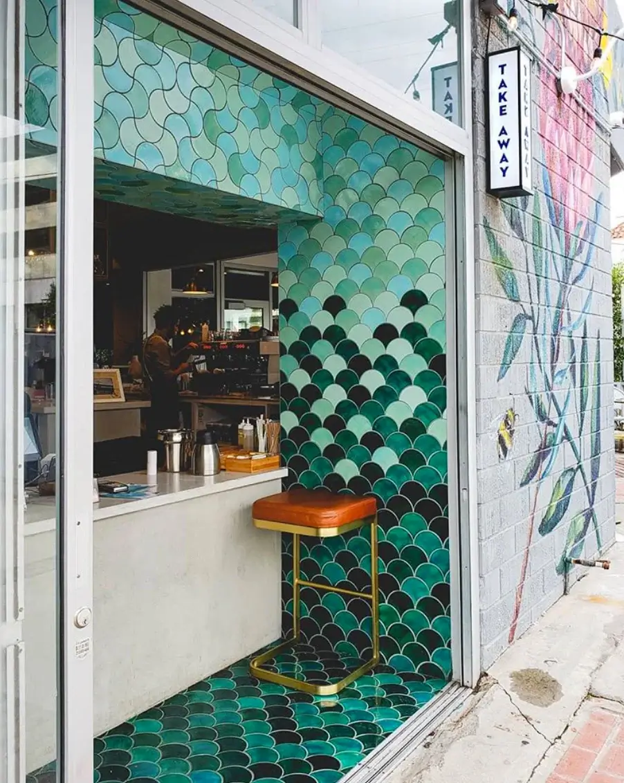
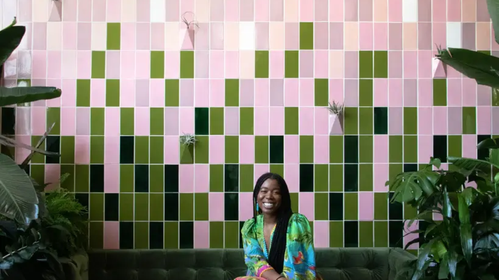
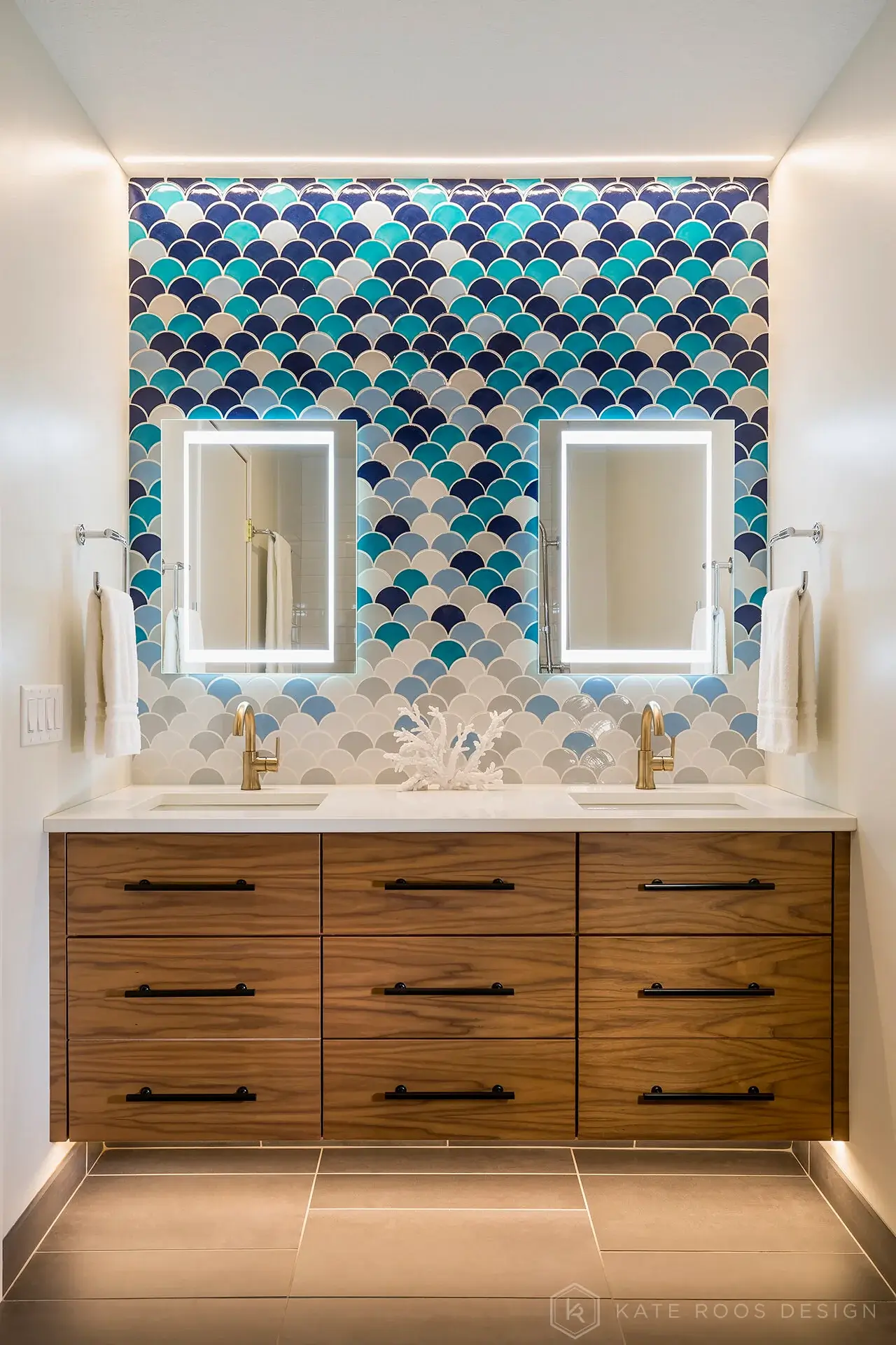
Tile That Feels Like Art (Because It Is)
Mercury Mosaics continues to blur the line between material and artwork.
Handmade, highly saturated, and unapologetically playful, their tiles are designed to be seen—not just fill space.
Why this matters:
Color in tile isn’t just about hue—it’s about variation, texture, and movement. It adds depth you simply can’t replicate with paint.
Takeaway for your home:
Even a small application (think: niche, backsplash band, or powder room wall) can completely shift the personality of a space.
Hardware That Actually Finishes the Design
Richelieu is bringing color down to the smallest details—and it’s making a big difference.
We’re seeing hardware move beyond brushed nickel and matte black into tones that coordinate—or intentionally contrast—with cabinetry.
Why this matters:
Hardware is the jewelry of the home. When it’s thoughtfully selected, everything else feels more finished.
Takeaway for your home:
Don’t default to “safe.” Hardware is one of the easiest places to experiment with color without blowing your budget.
So… Is Color a Trend or a Shift?
Here’s the honest answer:
It’s not just a trend—it’s a reaction.
After years of minimal, neutral interiors, people want homes that feel personal, expressive, and a little more alive.
Color does that instantly.
Where to Start (Without Regret)
If you’re intrigued but hesitant, start here:
- Low commitment: lighting or hardware
- Medium commitment: faucets or smaller tile applications
- High impact: full tile walls or color-forward kitchens
The key isn’t going all-in everywhere—it’s choosing one moment and doing it really well.
Final Thought
Good design has always been about balance.
What’s changing is this:
Color is no longer the risky choice.
Playing it safe is.
Add a Comment